
From paper sketches to the production server
Create directly in the browser with real HTML elements and adaptive grids. Use the full power of CSS3 with intuitive tools.
Design for all devices using easy to manage—custom—media queries. Seeing and feeling the site develop in a production environment is the way of the modern web.
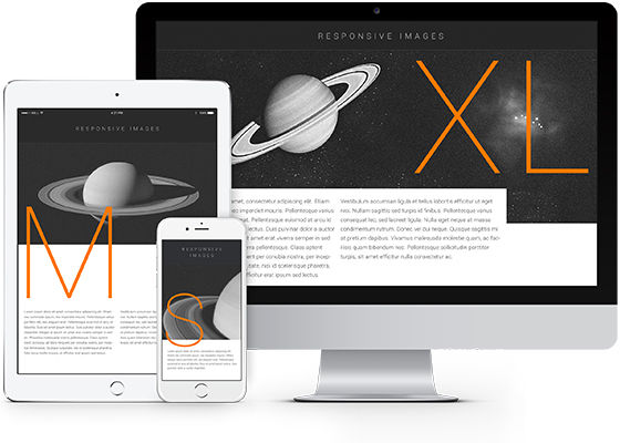
Custom layouts that fit any device
Add rows and content containers with just a simple click. Toggle column spans at custom breakpoints to create tailored layouts for smaller screens. Or create tailored tablet, laptop, desktop and everything in between layouts if you design mobile-first.
You can even use subgrids and container nesting for more ultra-precise layout control. Stretch rows, stop floats, change display properties, constrain heights...this app has it all!
Live Design — Clean Code
Working directly in the browser not only creates the unique live design experience, it also allows the code to be semantic and clean. No (confusing) code generation is needed, the CSS3 is written directly to a real stylesheet, resulting in clean and easy to interpret rules.
The inserted HTML elements are standards based. Tags can be switched with two simple clicks to use semantic HTML5 elementslike <nav> and <header>, resulting in well marked-up pages and conveying meaning to search engines.

